Yesterday, while finishing the installation of our first exhibition since Covid-19, a small collection of French portraits printed in the woodburytype process, a student asked me if the images on the wall were “original.” As savvy as this generation is concerning the use of photographic images, I knew she was not asking me to parse out the difference between a work’s influences and those that are simply derivative. Being steeped in seeing photographs pop up in multiple formats, she, like many, have a need to know if original or contemporary copies were on exhibition. Affirming that these images were created during the lifetime of the artist, from the artist’s negative, she smiled, but, when I mentioned they were not printed by the artist, her quizzical look returned. I asked her to entertain the importance of artistic intent and how this might influence an artist authorizing an image to be printed in an edition or in various formats. If all goes well, I hope she will contemplate how an artist’s original image can be uniquely communicative yet intentionally made accessible through several or more surrogates. In this light, by considering the expectations early photographers held for their work, I intend to use this essay to explore the question of artistic intent further, particularly in regard to artworks accompanying the printed word, and, perhaps, in consideration of the woodburytype, awaken interest in a neglected media seldom spoken of today.

published 1873, Paris Theatre
Photography arrived twice in 1839, with Louis Daguerre in France and Henry Fox Talbot in England. Each of these men announced viable processes within months of each other. The first recognized photographic process, Louis Daguerre’s daguerreotype, was incapable of being anything but a singular image; while Talbot’s positive/negative approach most certainly was not. Though grainy, Talbot’s images were reproducible and, whether by foresight or luck, Talbot understood the potential of photography to replace hand-drawn book illustrations and intended to act upon it. Between 1844 and 1849, Talbot issued six installments of The Pencil of Nature, the first commercially produced publication illustrated with photographs, and the most astounding development in human communication since movable type. Intending to continue, Talbot was forced to draw back as the venture unfortunately lacked commercial success. His instincts, though, were correct: Talbot envisioned photographs fulfilling a wide range of illustrative and documentary needs, even imagining the light of the sun aiding in the dissemination of art, if not actually being art.
The first twenty-five years of photography saw stand-alone images such as the daguerreotype, ambrotype, and ferrotype develop alongside reproducible negative/positive salt and albumen processes. The ability to print with light-sensitive albumen, refined in France in the mid 1850’s by French photographer Louis Désiré Blanquart-Evrard, built on Talbot’s earlier work to become the dominant process for creating multiple prints from one negative. It held sway for over 40 years. By the 1860’s, albumen photographs were being sold as individual images as well as illustrations of printed material. William and Mary Howitt’s Ruined Abbeys and Castles of Great Britain, published in 1862, included 27 albumen images, each approximately 5-8 cm in diameter. Created by several noted photographers, including Francis Bedford, George W. Wilson and Roger Fenton, the book saw a second updated edition in 1864. Unfortunately, due to the variability of the individual chemistry applied in the albumen process, several of these photographs, despite protection between the pages of a book, present a degree of fading when viewed.
Ruined Abbeys and Castles of Great Britain
Certainly Bedford, Wilson, Fenton and the others did not intend this. Their desire was to see a clean print created from each negative, regardless of size. However, at that time print degradation would have been an unexpected consequence, and rich tonal images the norm. Given the limited development of manipulation of negatives in printing, the artist’s intention for the image could be said to exist in the quality and composition of the negative. Well composed, readable and consistent images of the castles and abbey ruins of England are what William and Mary Howitt saw when they opened a copy of their book. We accept these works with faded edges today because we are several generations removed from the day of publication, and have few other examples with which to compare. Unfortunate as this is, it becomes even greater a loss when we realize the Howitt’s romantic paean to England’s lost heritage saw publication just a few years too early to benefit from a more permanent photographic medium, and it is amazing the woodburytype, the eponymous invention of Walter B. Woodbury, is not better known for that very reason.
Woodbury introduced his process in the May 1865 edition of the British Journal of Photography, and within five years firms in France and America were producing woodburytypes. Like the daguerreotype before it, both developments were ‘first of their kind’ photographic achievements; the daguerreotype, the first practical photographic process and the woodburytype, the first practical photomechanical reproductive process. More importantly, the image quality produced by each remains unequaled in their respective fields; as photographs, daguerreotypes reveal concise detail even when magnified while woodburytypes show none of the grain or dissolve associated with photogravure or half-tone reproductions under similar scrutiny. Simply put, the woodburytype, as described by Barret Oliver in A History of the Woodburytype (Carl Mautz Publishing, 2007), “stands as the ultimate in photographic achievement: unparalleled tonal rendition, beautiful delicacy in shadow and highlight areas, supple surface texture, permanent beyond all other processes and accessible to a wide range of people as published reproductions.”
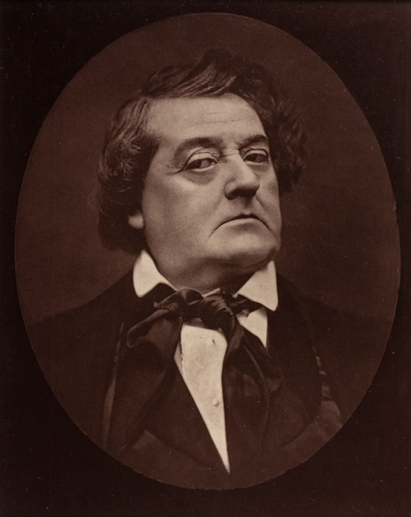
My first notice of the woodburytype was an image of the artist Honoré Daumier by the photographer Gaspard-Félix Tournachon, better known as Nadar. It had been taken some time between 1870 and 1879, and came across my desktop while doing research for a 2012 exhibition of Daumier’s lithographs. At that time, Daumier was primarily celebrated for caricatures published in a variety of periodicals; a profession for which Nadar was also renown before becoming a photographer. I found it fascinating to investigate the face of the artist who could so easily capture a person’s features in a few lines. Daumier had always been a bit of an exemplar for me. With the image available as a loose Galerie Contemporaine page on a bookseller’s website, it soon fit into the exhibition, not simply as an artifact of Daumier’s life, but also as a strong example of a parallel approach to portraiture on the part of Nadar.
published circa 1880, Galerie Contemporaine
Nineteenth century photographers, such as Nadar, Etienne Carjat and Pierre Petit, were cognizant of the aesthetic developments of portraiture since the Renaissance. A certain attention to chiaroscuro can be found in many of their portraits; the light falling over Daumier’s left shoulder is a prime example. Nadar catches the elder artist restlessly turning, slightly blurred, white hair brushed back and woolen overcoat open, as if he is ready for his sitting to end. Daumier appears a little discomforted in being relegated to the role of subject rather than observer. His many years as a caricaturist and social commentator did not prepare him for the infallible honesty of the camera. I am thankful Nadar captured as much as he did. It was not until a few years later when I began researching the woodburytype process that I realized, and I imagine Nadar would agree, is the strength of Walter Woodbury’s achievement.
Woodburytypes, unlike developed or printed out processes, are one step removed from the light-sensitive surface, rendering them a print, rather than a photograph. Essentially, Nadar provides the negative to be printed to Goupil et Ce, the firm producing the woodburytype print. The negative is then placed on thick layer of dichromate gelatin and exposed to UV light, causing the gelatin to harden as a positive image according to the amount of light passing through the various levels of negative density. When soaked in warm water, the unhardened surface of the gelatin washes away leaving a slight positive topographical impression where the negative had been. After desiccant drying, the surface is pressed into a piece of lead, producing a negative plate from which any number of impressions of Daumier’s portrait can be taken.
These are done by combining a colorant, such as India ink, with a liquid gelatin to produce a transparent mixture. Placing a daub of this media onto the center of the lead plate, a piece of paper is laid on top to receive the impression. When pressed under a sheet of glass, the gelatin mixture fills the cavities according to the density of the original negative recorded on the lead matrix, and the excess mixture is squeezed from the sides. Once dry, the print is trimmed and mounted, creating a continuous-tone positive unlike any other commercially printed image. The amazing part of the process exists in the mixture’s permanence over many generations, something I believe Nadar would find incredibly pleasing. It was, after all, Daumier who, in a drawing published in the 1862 issue of Le Boulevard, immortalized Nadar photographing the city of Paris from a balloon. Daumier drew this in response to a court ruling permitting photographs to be recognized as “works of art.” The caption below the drawing reads, “Nadar elevating photography to the height of art.” Through his woodburytype print of Daumier, unchanged over the past century and a half, Nadar, in many ways, has the last word.
Now, there are many extant examples of photographic processes still in prime condition, but many more have changed considerably. When we look at the not quite intentional aesthetic of faded salt prints or yellowed albumin prints, we accept what we see much like we have accepted the dirty ceiling of the Sistine chapel or the translucent whiteness of Greek sculpture, not realizing that Michelangelo and the ancient Greeks saw bright luminous color when their work was first exhibited. We accept the muted tonal range of early photography just as we might have accepted the dirty varnish adding a golden hue to our perception of Baroque painting. We know who is important and accept what we see because we are incapable of lifting the veils of inconsistent chemistry and time for a fuller aesthetic experience. The Woodburytype, though a photo-mechanical process, with all the negative weight the word “mechanical” carries, is, at its best, an unparalleled offering of the intentioned aesthetic of 19th century photographers. Anyone who loves early photography should pay attention.
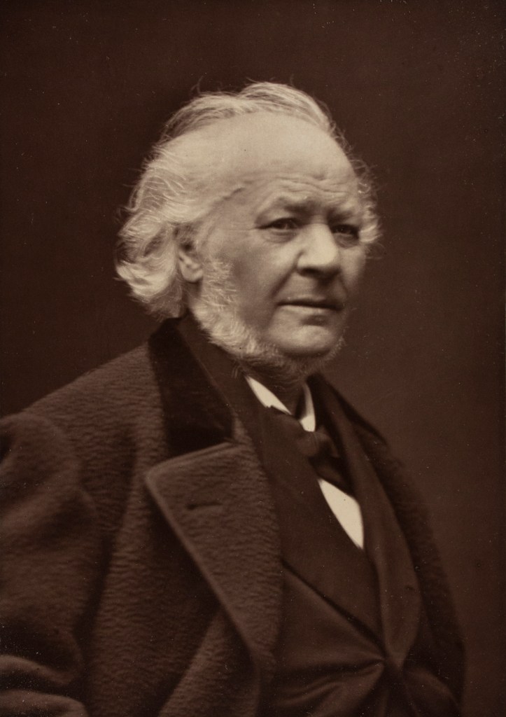
The exhibition on display in the Crisp Visual Art Center, Woodburytype Portraits from mid-19th century France, is an initial introduction to the quality of these images. Present are portraits of artists, writers, actors and leaders by various photographers, including Nadar, Etienne Carjat, Pierre Petit, and Ferdinand Mulnier. Appearing in various publications, the woodburytype prints were occasioned by the sitter’s recent achievements or, in some cases, demise. The French Playwright and actor, Frederick LeMaitre, appears twice in the show: once in an image from the 1873 periodical Paris Theatre by Etienne Carjat and again in a larger portrait, perhaps from the same sitting, printed in the Galerie Contemporaine after his death in 1876.
published 1873, Paris Theatre
Possibly taken several years prior to publication, the images are in fairly fine condition, considering their age and handling over time. To enhance the exhibition’s focus on the prints as images, each is presented framed with the mat covering any accompanying text, as all were glued either into the newspaper, Paris Theatre, or the more substantial pages of the Galerie Contemporaine. Acquired from book and gallery dealers as loose pages and/or damaged or incomplete publications, any existing text has been fully photographed to assist with future research regarding the individuals depicted.
Given their existence for nearly 150 years, each photographic print still clearly conveys not only their creator’s insight as a portraitist, but also the priorities of mid-19th century practice involving attention to likeness and composition. Early practitioners of photography encountered a representational paradigm shift in the absence of color. This abstraction from reality fueled questions about photography being a product of science or an object of art, though it was clearly the child of both. Generally, photographic images were perceived as having greater veracity and accessibility than hand drawn or painted images, though their monochromatic nature had more in common with traditional printmaking media than painting.
French portrait photographers had many monochrome sources to reference in exploring the aesthetic possibilities of the camera. One of the most noticeable, yet rarely explored, is the 17th century French portraitist Robert Nanteuil (1623-1678), who single-handedly raised the art of engraving from the ranks of the mechanical arts to royal recognition as a fine art. In so doing he influenced generations of portraitists. Nanteuil, a master of both pastel and engraving, endeavored to make his subjects comfortable in the studio in order to achieve a relaxed reflection of the sitter’s character. He would even go so far as to tell them jokes and amusing stories to put them at ease. It is, perhaps, this practice that underlies the work of the more accomplished early photographers. Nanteuil’s influence can be detected even in the use of the oval portrait format found in Etienne Carjat’s portraits of Frederick Lemaitre and Pierre Berton; Nanteuil is believed to have popularized the oval’s application to portraiture. One additional Nanteuil influence, embraced by both Nadar and Carjat, is the practice of presenting his sitters in a plain background shaped by light, something Nanteuil’s contemporary, Rembrandt, was exploring to great effect in Holland.

published 1873, Paris Theatre
All the portraits on display carry this attention to light and were most-likely shot in a studio lit predominately by a skylight. Controlling the amount and angle of the light with reflectors and mirrors would allow the photographer to reveal what nature presents in a person’s form and visage. Though Nadar disparaged the lack of skill needed to practice photography, his awareness of light being the key to an aesthetically beautiful image was something that, in his own words, “cannot be taught.” It is his attention to light that continues to reward the viewing of Nadar’s photographs today, and this is revealed most clearly in the woodburytype images.
One of the most important aspects of having so many woodburytypes in exhibition is the ability to observe each photographer’s attention to the individuality of their sitters; this must have not have been an easy task considering the apparatus needed to remain still for several seconds in order to record an image. Antoine Samuel Adam-Salomon’s portrait of the composer Ambroise Thomas eschews the empty space found in Carjat and Nadar’s portraits but manages to convey the gravity with which Thomas understood himself to hold as Director of the Conservatoire de Paris. Thomas is positioned sitting in profile in an ornately carved and upholstered chair backed up against a table littered with book and paper. Adam-Salomon has Thomas slightly twist his body while holding what appears to be his watch in his left hand. Looking up Thomas fixes his eye directly on the photographer capturing all the sonority of a man destined to remain at the helm until his death.

published 1876, Galerie Contemporaine
There are many portraits worth mentioning, Etienne Carjat’s twelve portraits are marvelously rewarding as a group, but one by Pierre Petit captures something not widely found in the age of “you need to hold very still” portraiture: a simple knowing smile. Petit was very successful as a photographer with multiple studios and commissions. He photographed the International Exhibition of 1867, recorded images of the Siege of Paris and even attempted the first underwater photographs. The portrait he took of Rosine Bloch, a mezzo-soprano in the Paris Opera, however, brings together many of the approaches to portraiture discussed above.

published 1874 Paris Theatre
Petit places the artist near the center, leaning at a slight diagonal to her left, her body turned toward the viewer. She wears the costume associated with the role of Claribel in the opera, The Cup of the King of Thule by Eugène Diaz. Her long robe, with wide sleeves rimmed in dark smoke-stack like patterns, is tied across the middle with a striped sash. She wears a dark metallic headpiece adorned with variously shaped coins and a dark veil. Around her neck are several beaded necklaces with metal pieces echoing her headdress. One large medallion hangs from the longest necklace. Positioning her left arm upon a pedestal form, her long delicate fingers cross her mid-section to fall over her right hand. Comfortably, she turns her head and gazes to her right, as a soft light floats toward her to highlight the side of her face. Petit chooses the moment she turns, calmly connecting with someone or something outside the frame, and smiles. Known for her incredible beauty, Bloch, emanates a certain enigmatic quality that is both comfortable and welcoming. This is possibly why Felix Jahyer, the editor of the Paris Theater, found her operatic performance “the greatest success of her career.” Pierre Petit’s portrait of Bock brings this wholly into a scene of his making and we see it today because of the quality of the woodburytype process.
I hope this brief article brings you some appreciation for the humble woodburytype; images often dismissed by collectors of photography, and a process frequently found as a footnote in photographic history. If you, as a collector, are interested in acquiring quality images, they are in limited supply but generally affordable with almost all are under 20 cm x 25 cm. Woodburytypes can be most easily found in publications from 1868 through the 1890’s, but were also sold as individual mounted images, though these are harder to identify due to their visual similarity to the carbon print. After 1890, the half-tone process revolutionized mass media and, within a decade, woodburytypes were all but eliminated. Recently, however, several artists, including Barrett Oliver, have begun producing work through the woodburytype process. Given the media’s longevity, these images, along with their 19th century ancestors, will surely be present for many years to come.
